Nicole
A promotional landing page for Nicole, an exclusive architectural property in the historic centre of Moscow.
(01) Project purpose
To create a promotional landing page for Nicole, an exclusive architectural property in Moscow, with a focus on communicating its distinctive character, premium status, and architectural identity.
The main objective was to develop a visual presentation that conveys the property’s value and creates a strong first impression before potential buyers explore its features and details.
The design needed to communicate a sense of understated luxury through carefully considered compositions, refined typography, a sophisticated color palette, and a clear content structure — keeping the property itself at the center of attention.
Key objectives:
- 01
Communicate the property’s status — create a visual identity that reflects its exclusivity and premium positioning.
- 02
Highlight architectural character — use composition and carefully selected visual details to emphasize what makes the property distinctive.
- 03
Establish a refined visual language — combine sophisticated colors, typography, and layout to create a cohesive premium experience.
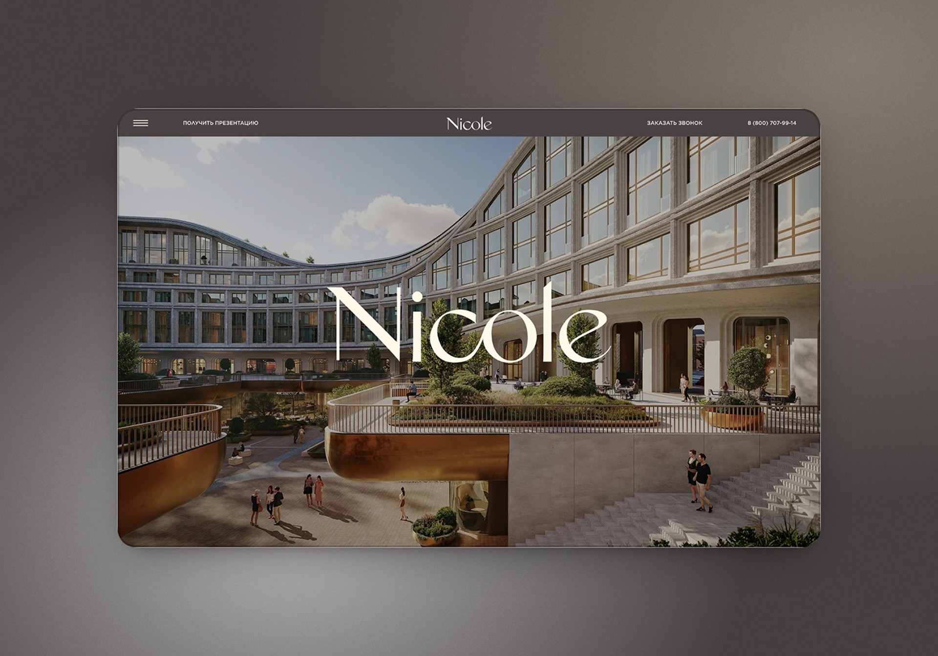
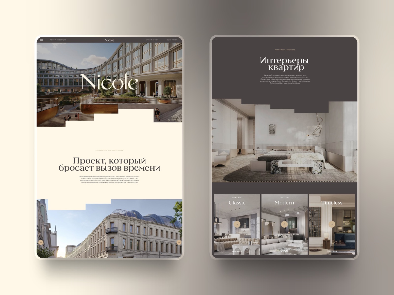
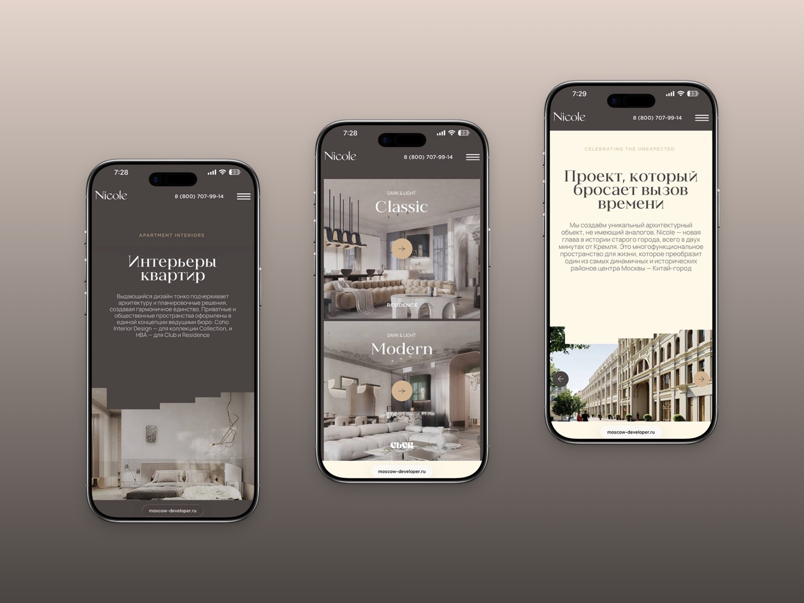
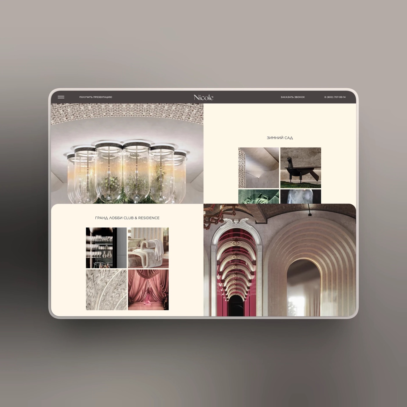
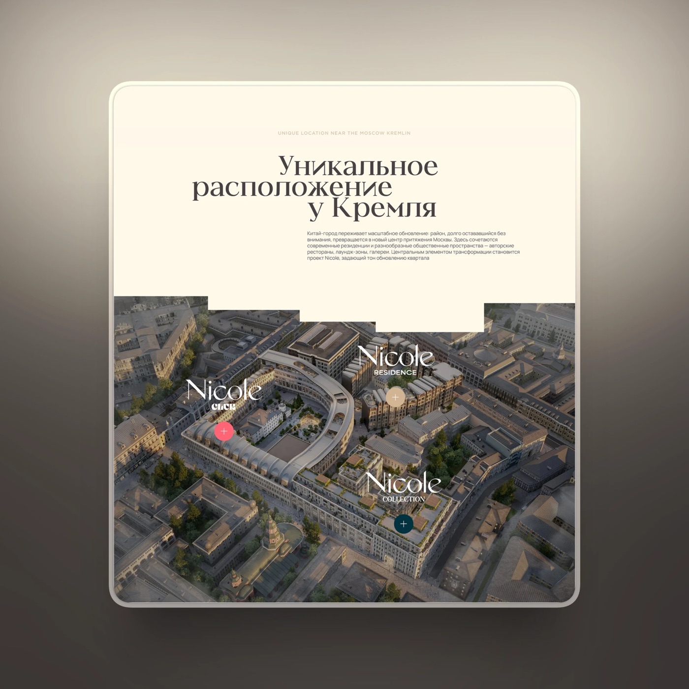
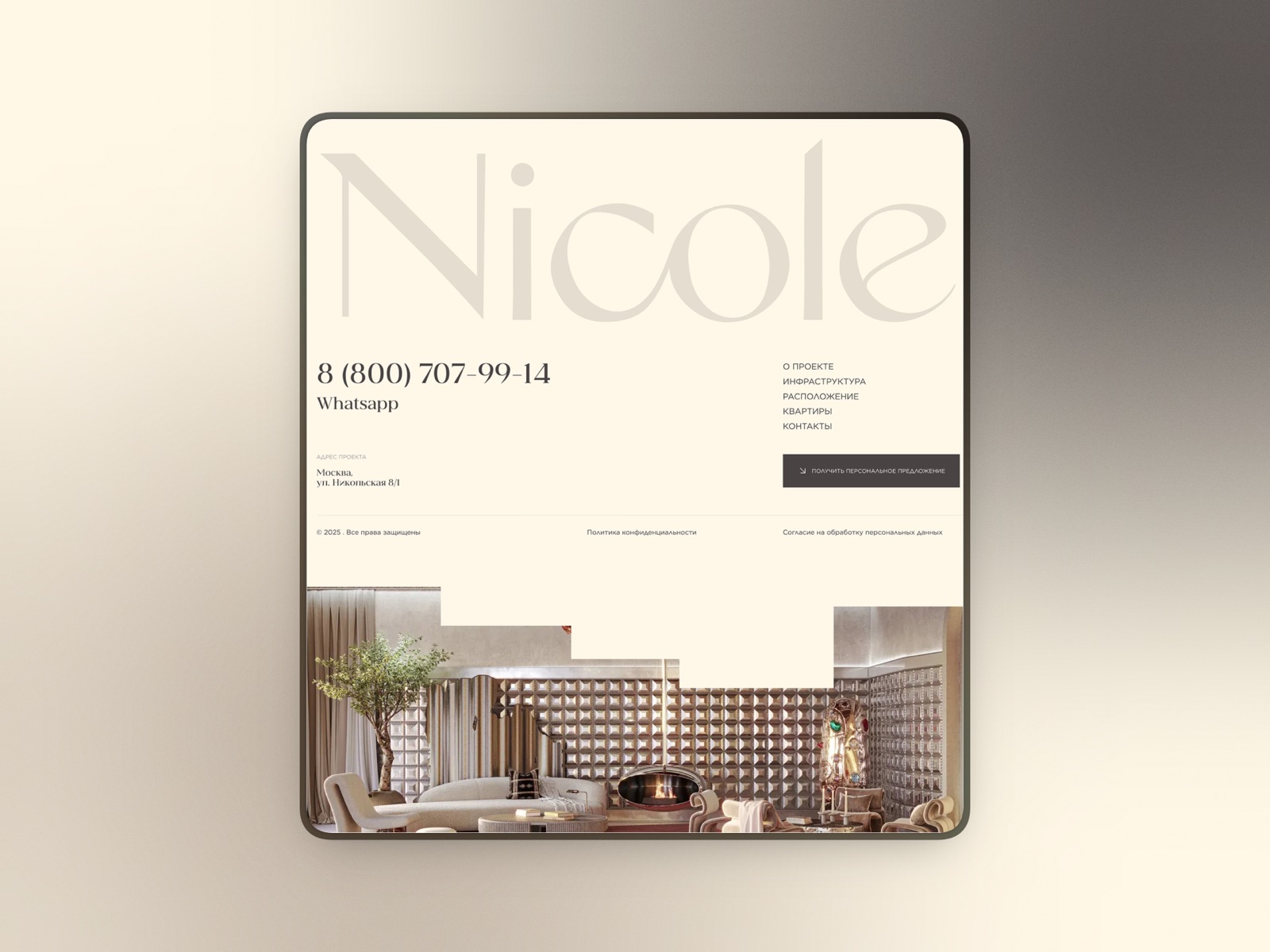
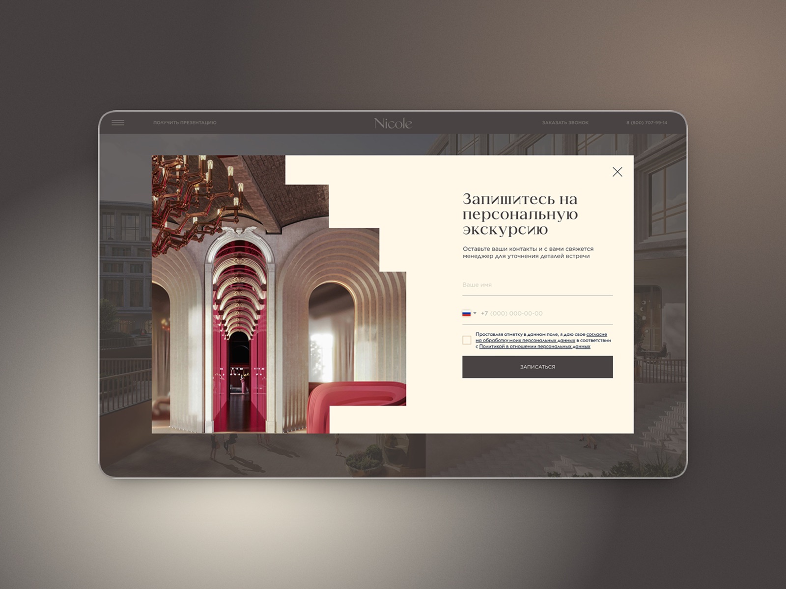
Fig. 01 to 07
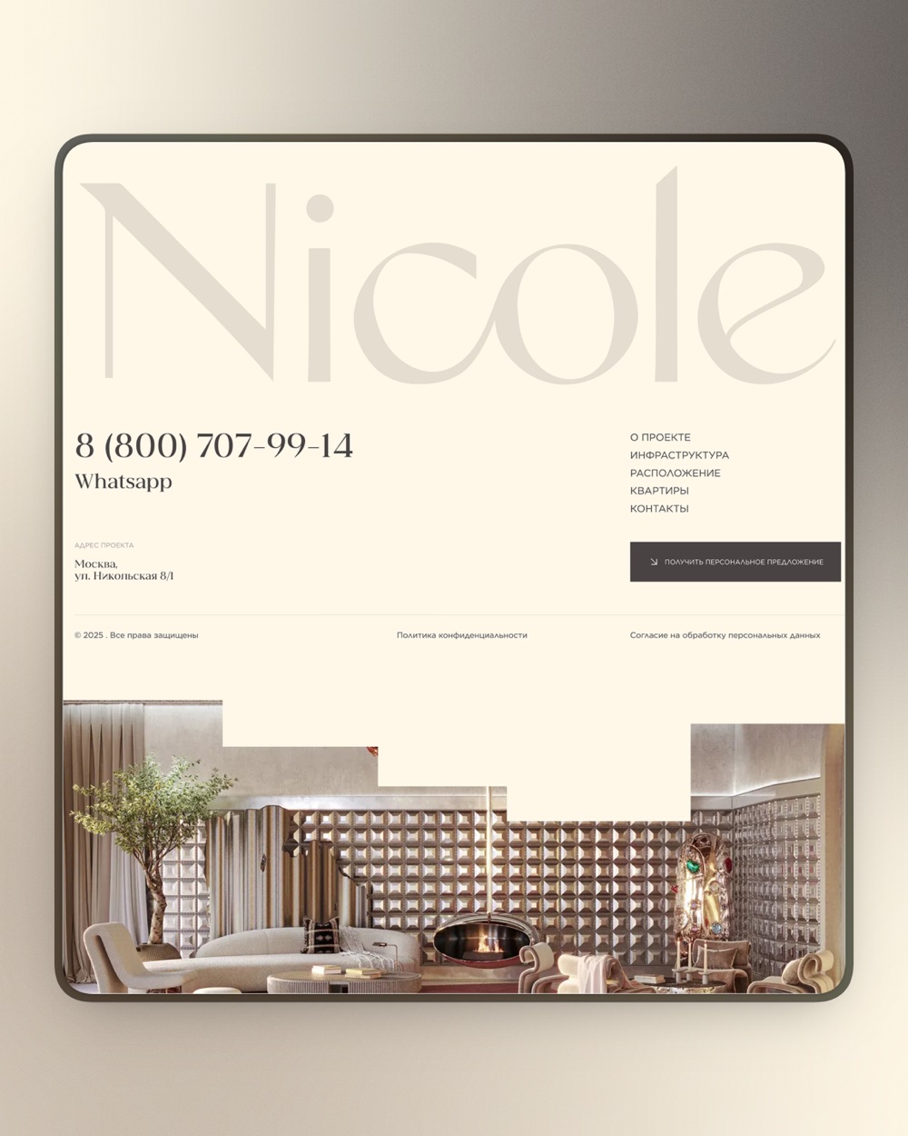
Warm ivory and deep taupe, an expressive serif and stepped image crops that echo the building’s façade give the page a quiet, gallery-like luxury — the architecture always stays in the spotlight.
(02) Achieved goals
Developed a cohesive visual concept and landing page structure that communicate the property’s exclusivity and architectural character through a restrained, elegant design.
What was delivered:
- 01
Visual concept — created a sophisticated design language that reflects the property’s premium positioning and distinctive identity.
- 02
Visual hierarchy — structured the content and compositions to draw attention to the property’s most important features and architectural details.
- 03
Typography and color palette — selected refined visual elements that reinforce the sense of exclusivity without overwhelming the presentation.
- 04
Content structure — organized the information into a clear and cohesive narrative, allowing visitors to explore the property while maintaining focus on its key advantages.
The result is a promotional website that works as a digital extension of the property’s identity. Through a restrained visual approach and carefully structured presentation, it communicates the character and value of Nicole while creating a strong premium impression from the very first interaction.
“I ordered a landing page for a complex, high-status property and was worried it would be difficult to capture the right atmosphere. But the result turned out even better than I expected: a clean, sophisticated presentation where every detail contributes to the overall sense of luxury. I never once had to say ‘make it look more expensive’ — from the very beginning, it was clear the taste and understanding of the premium segment were already there. Thank you for the professionalism!”

Start a project